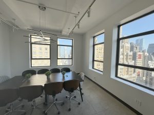
Ever walked into your Manhattan workspace and felt instantly drained by those soul-sucking generic white walls? You’re not imagining things. Office colors (or the lack of them) impact everything from your creativity to your coffee consumption.
NYC commercial spaces face a reckoning: uninspired color schemes no longer cut it when competing for top talent and peak performance. Smart property managers know the secret weapon hiding in plain sight – strategic color psychology that transforms ordinary workspaces into productivity powerhouses.
From Wall Street’s power blues to Brooklyn startups’ energizing oranges, office colors speak volumes about company culture while subtly influencing work output.
Science proves it, too.
The Science of Office Colors: Your Walls Are Talking (And Your Brain Listens)
Think office colors exist purely for aesthetics? Think again. The colors surrounding you during your workday all serve a purpose and secretly hack your brain chemistry. In fact, a closer look reveals that it affects everything from your blood pressure to your brainstorming sessions.
Your Body Sees Red (And Blue, And Green…)
Office colors literally change how your body functions. Wild, right?
According to Joseph White, design strategy director at MillerKnoll (the world’s largest office furnishings company), “Saturated colors have the capacity to change our respiration, our blood pressure, and even our body temperature.” He references a study where participants in pale-colored rooms had lower heart rates and felt more relaxed, while those in vivid yellow or blue environments scored higher on reading comprehension tests.
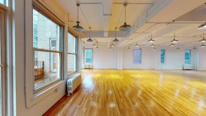
Perhaps that’s why today’s workplaces are embracing “color-drenching” – immersive spaces where walls, floors and ceilings share a single bold hue. These environments don’t just look stunning – they spark creativity during brainstorming and help reduce inhibitions.
Even furniture is evolving, with companies developing single-color office chairs to reduce “optical static” and create distraction-free zones for analytical thinking.
Color Me Productive: Programming Your Workspace Psychology
Office colors act like mood switches that you can flip with a paint roller, and smart companies know it. Many, in fact, match office colors to specific work functions to essentially program rooms for particular tasks.
For instance, if you’re looking for more collaboration, warm office colors like oranges and yellows naturally stimulate conversation and idea-sharing among team members — a pattern confirmed in Steelcase research on color and performance, which found that color can influence collaboration, mood, and energy levels in office environments.
Schedule-driven environment? Cool blues demonstrably enhance time efficiency during meetings, cutting rambling discussions and keeping teams focused.
Feeling overwhelmed by Manhattan’s pace? Sage green and nature-inspired office colors provide the mental reset button your brain craves. These hues measurably lower stress indicators and create psychological space for deeper thinking.
Working From Home Changed Everything (Including Your Color Preferences)
The pandemic fundamentally rewired our expectations about office colors. After months of being surrounded by personally selected home office colors, employees reject returning to sterile corporate environments.
As Benjamin Moore’s Andrea Magno told the Wall Street Journal, “People enjoyed being surrounded by colors that were more reflective of their personality.”
Skip this psychological need and good luck getting talent back to the office. No wonder NYC’s hottest commercial properties now feature home-inspired colors that make workplaces feel both comfortable and productive.
Strategic Color Trends in Office Design: Corporate Crayon Science Gets Serious
That subtle mood shift you feel walking between different rooms? It’s not your imagination—it’s color psychology at work. NYC’s smartest companies now program entire workday experiences through strategic office colors. They’re turning walls into productivity tools; the results speak for themselves.
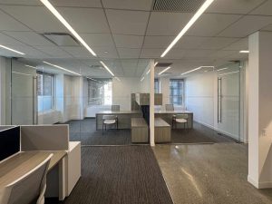
Blue Rooms, Deep Thoughts: The Magic of Concentration Zones
You know that mental fog that hits around 2 PM? Try walking into an all-blue room and watch it evaporate.
Manhattan design firms have discovered that color-drenched environments—the same shade on walls, floors, furniture, everything—cut through brain clutter better than your strongest espresso.
MillerKnoll’s research backs this up, too. It shows our brains love monochromatic spaces for analytical work, and it’s for a lot more straightforward reason than you’d think. This aligns with findings from a systematic review published on ResearchGate, which concluded that blue and other cool tones support improved focus, lower stress levels, and greater cognitive clarity in office settings. Our visual processing system chills out when it doesn’t need to register fifty different colors.
Stroll through any renovated NYC office space and spot these deep-focus blue zones. They’re like mental gyms where your brain can finally lift some serious cognitive weight without the visual distractions.
Paint Your Purpose: Color-Coding Productivity Zones
Monday requires creative thinking, Tuesday demands analytical focus, and Wednesday mandates back-to-back meetings. Your brain craves visual cues to shift gears, and office layout whiplash is very real.
That’s why smart companies now deploy office colors like secret productivity weapons.
Brainstorming areas pop with energizing oranges and yellows that physiologically nudge you toward better ideas and more interaction. Strategic decisions happen best in blue conference rooms where analytical thinking automatically sharpens. Working solo calls for neutrals that help tune out distractions.
And here’s a pro tip—if your analytics team keeps making careless errors, check your walls. Red office colors kill analytical thinking like kryptonite; save those red accents for spaces where emotional energy trumps logical precision.
Corner Office, Dark Walls: Power Plays in Pigment
Let’s be real—office colors reveal the truth about company hierarchy faster than an org chart.
Have you walked past those executive offices lately? Notice the trend toward darker, richer office colors? Those black and deep green walls aren’t random style choices. They visually scream “authority” and “privacy” while creating psychological boundaries that say “important decisions happen here.”
The contrast between lighter communal spaces and those dark executive lairs creates an instantly visible power dynamic. But companies beware—those imposing dark colors (especially on ceilings) can feel oppressive to employees. Your office colors telegraph your management philosophy whether you realize it or not—and your team reads these signals loud and clear.
5 Ways You Can Use Color to Optimize Your Office
Look, your office walls are talking to your team’s brains whether you planned it. That sad cube farm? It’s killing productivity. Your neon break room? Probably why no one eats lunch there. Let’s fix your office colors situation without calling the landlord or blowing your budget.
- Blues for Brains, Oranges for Ideas: Your finance team keeps missing deadlines while your creatives hit walls. The office colors might be the culprit. Slap some blue paint where you need people crunching numbers—it literally helps their brains focus. Surround your marketing folks with orange or coral to get them firing on all cylinders. Psychology works whether you believe in it or not.
- Divide and Conquer with Color-Coded Zones: Paying $85 per square foot for your Midtown lease demands making every inch work harder. Ditch those expensive dividers. Smart office colors create invisible walls your team’s brains respect. Your team will instinctively go where they need to be; no floor plan needed.
- One Color to Rule Them All (For Focus Areas): When developers can’t concentrate, try this weird hack: make everything at their workstation the same color. Chairs, desks, dividers—one unified shade cuts mental noise. MillerKnoll found these monochromatic office colors help brains lock in like nothing else. Perfect for coders, analysts, or anyone whose job requires deep focus.
- Play It Safe on Permanent Surfaces: Most NYC commercial leases make committing to trendy office colors risky. Keep walls and floors neutral, then express your color strategy through stuff you can take. Rugs, art, furniture—these moveable elements let you test different office colors without your landlord having a fit about that purple accent wall when you move out.
- Lead with Dark, Include with Light: Executive suites command more respect with darker office colors like power navy and forest green. But watch the contrast between boss spaces and worker areas—too stark a difference kills your “we’re all in this together” culture faster than announcing bonus cuts at the holiday party.
Paint Your Way to Profit: The Bottom Line on Office Colors
Office colors work as stealth productivity weapons hiding in plain sight. While your competitors debate the ROI on new standing desks or fancy coffee machines, you could outperform them with a few strategic gallons of paint.
NYC commercial tenants face unique pressures: astronomical rents, cutthroat talent competition, and constant innovation demands. Smart office colors address all three. Employees stick around longer in well-designed spaces. Prospective tenants fight over intelligently color-zoned offices. And your company instantly signals cutting-edge savvy when visitors see your deliberately color-coded workspace.
The science speaks for itself. Whether you’re running a creative agency in SoHo, managing hedge fund offices in the Financial District, or anywhere else paying premium Manhattan rent—your office colors can either boost or sabotage performance.
Your move, New York.